Find your perfect home
Problem statement
In 2018 Barfoot & Thompson was a thriving real estate company selling the most properties of any agency in the Auckland market. The company website barfoot.co.nz however had grown clunky and tired. It did not accurately represent the company for what it was; Auckland's largest and most trusted real estate agency. In the year prior the company had sold 10,000 properties, had a market share of 40% and had 15,000+ rental properties under management.
The asset
- 2.2 million page views per month
- Average time on page 1.12s
- Mobile views 50% Desktop 40% Tablet 10%
- 4000+ properties for sale or rent at any one time
- 1600+ agents
Desired key outcomes
Barfoot & Thompson occupied a dominant market position and it was clear that the company website did not reflect this. The company website was a key asset and often the first touchpoint the public had with the company's properties and people. The web stakeholders of CIO, CMO, CTO, tech lead, business analyst, digital marketing strategist and myself the UX designer outlined the intended outcomes for the redesign:
- Target key pages first using agile principles
- Increase new business leads to our people
- Showcase the property we market in the best possible light
- Portray the company and its people as industry leaders and experts
- Provide a great experience on any device
The initial state
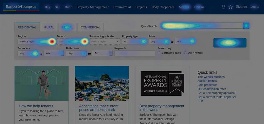
The website had deteriorated over a number of years due to a range of issues, see for yourself at waybackmachine.com
Reasons for the decline included:
- Visual and usability inconsistencies
- Bizarre semi responsive site with seperate mobile website
- All previous iterations were both designed and built by developers using waterfall methodologies
- The powerful company API was being used but only scratching the surface of it's capabilities
- New features & functions were designed on an ad-hoc basis with little respect for consistency and site maintenance
Users & audience
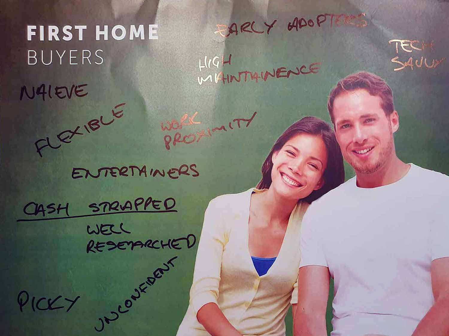
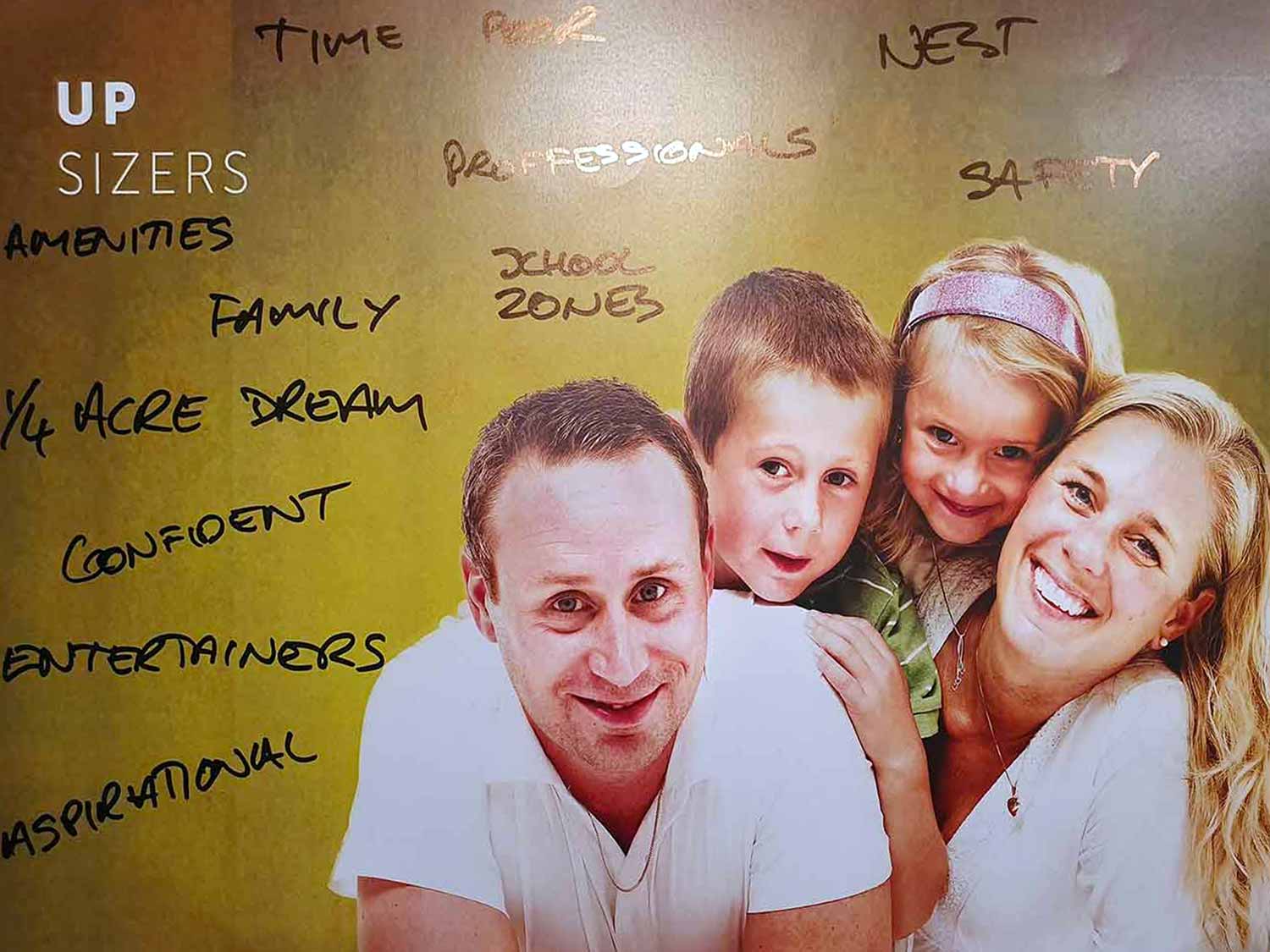
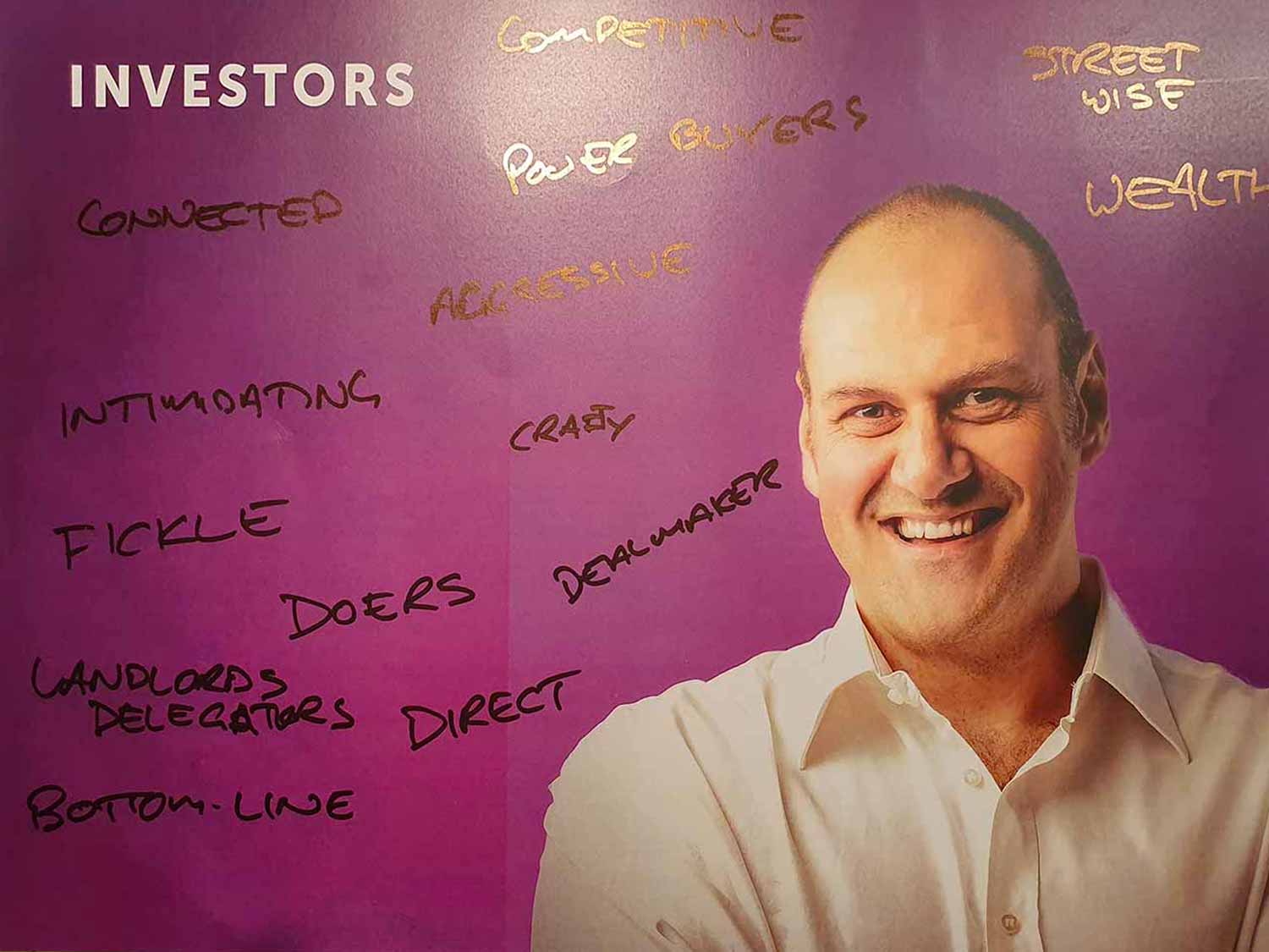
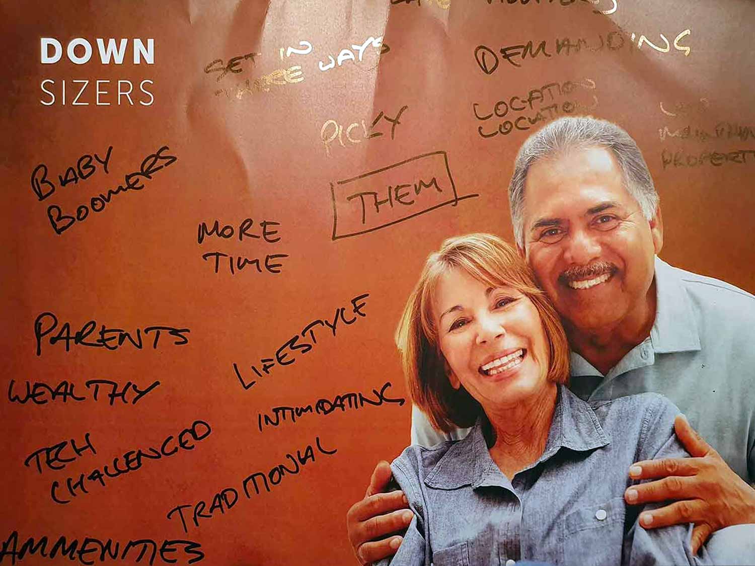
With over 400,000 active users a month* the audience of barfoot.co.nz was very broad. By talking to our agents about the customers they dealt with we arrived at 6 key personas that represented the categories of people involved in the sale and purchase of property. They were:
- First home buyers
- Upsizers
- Downsizers
- Investors
- Barfoot & Thompson agents
While never intended as a perfect representation of market participants these personas worked well in to stimulate constructive discussions internally. Our stakeholder group featured 3 C-suite executives - it was important that they step outside their lifestyles to consider the spectrum of buyers and sellers. Our personas were very constructive in this respect.

Getting to know the audience
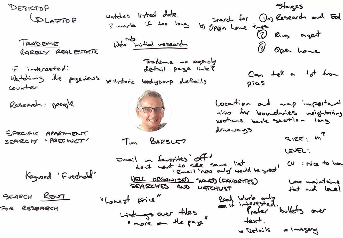
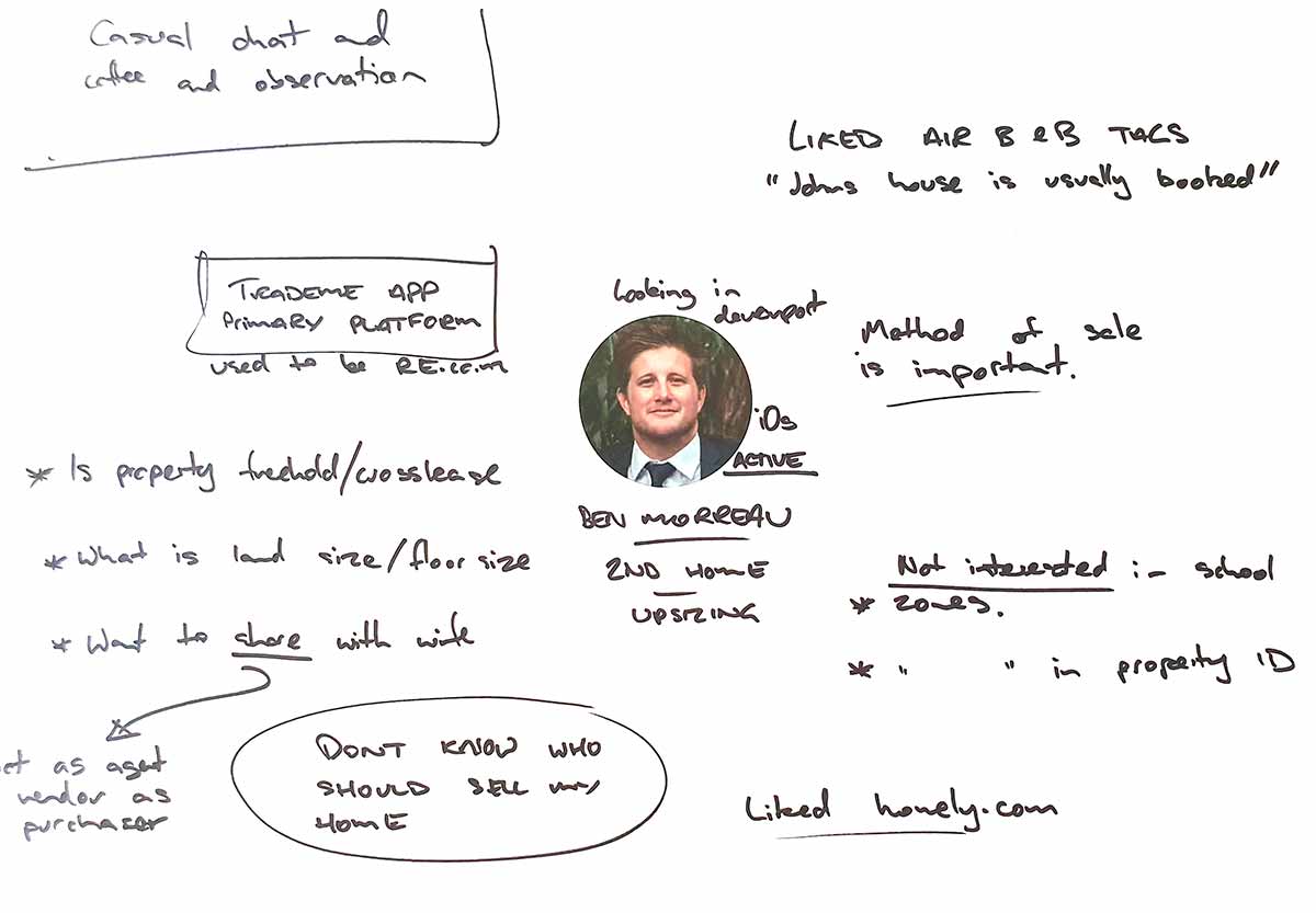
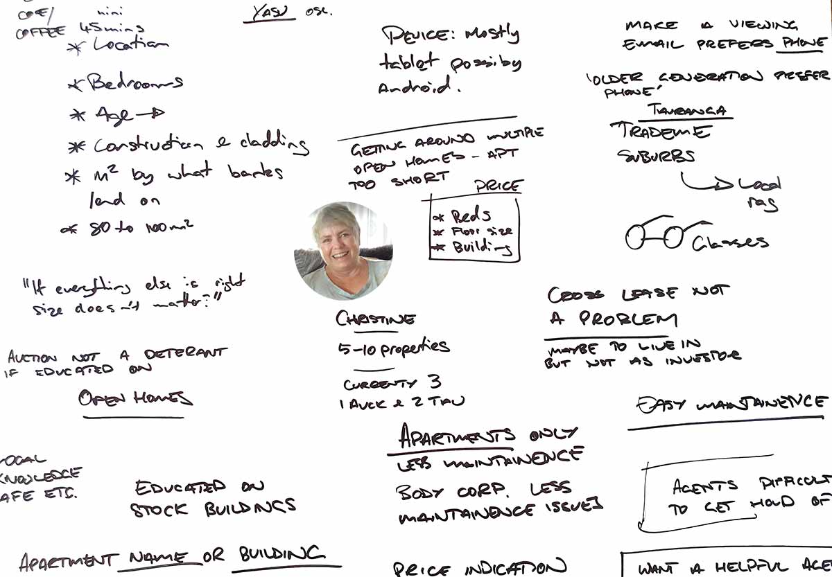
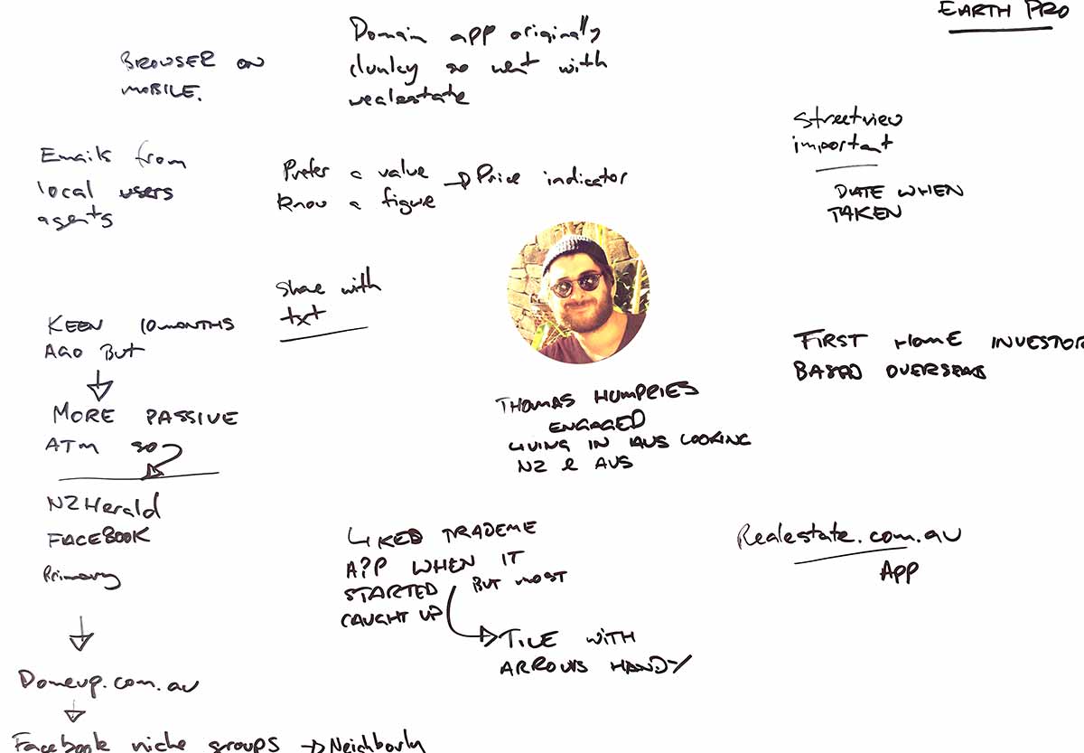
One on one interviews were conducted to understand the pressures and circumstances of buyers and sellers. The meetings were informal but mostly face to face and users were asked about their property interests, experience and particularly what their digital tools of choice were. Interviews by phone were conducted if users were out of area or overseas. These insights helped further build and evolve our user personas.
Street view, a good idea?
User personas were proved a valuable tool when evaluating the possibility of adding Google street view to our property pages. There were costs involved in the form of Google Maps API credits and we wanted to understand if users would see value in such a feature. In interviews with users the response to the feature was lukewarm from both upsizers and downsizers however overseas investors expressed enthusiasm.
First home buyers loved the feature as they had smaller budgets to work with and were frequently looking at property in lower socio-economic areas. Street view meant the user could survey a neighbourhood for street appeal and safety. This was particularly helpful when deciding whether traveling to attend an open home was going to be worthwhile or not. Upon being presented with this data the web stakeholders decided unanimously to proceed with Google Street View.
Validating the new concept
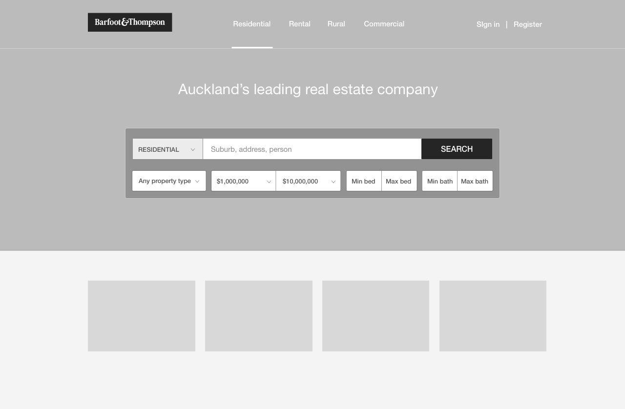
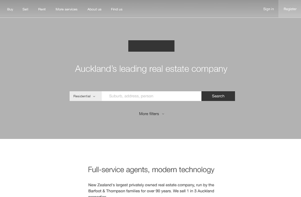
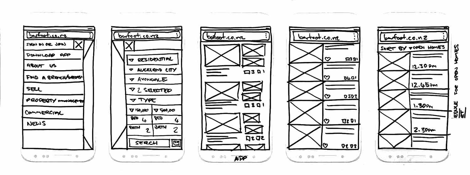
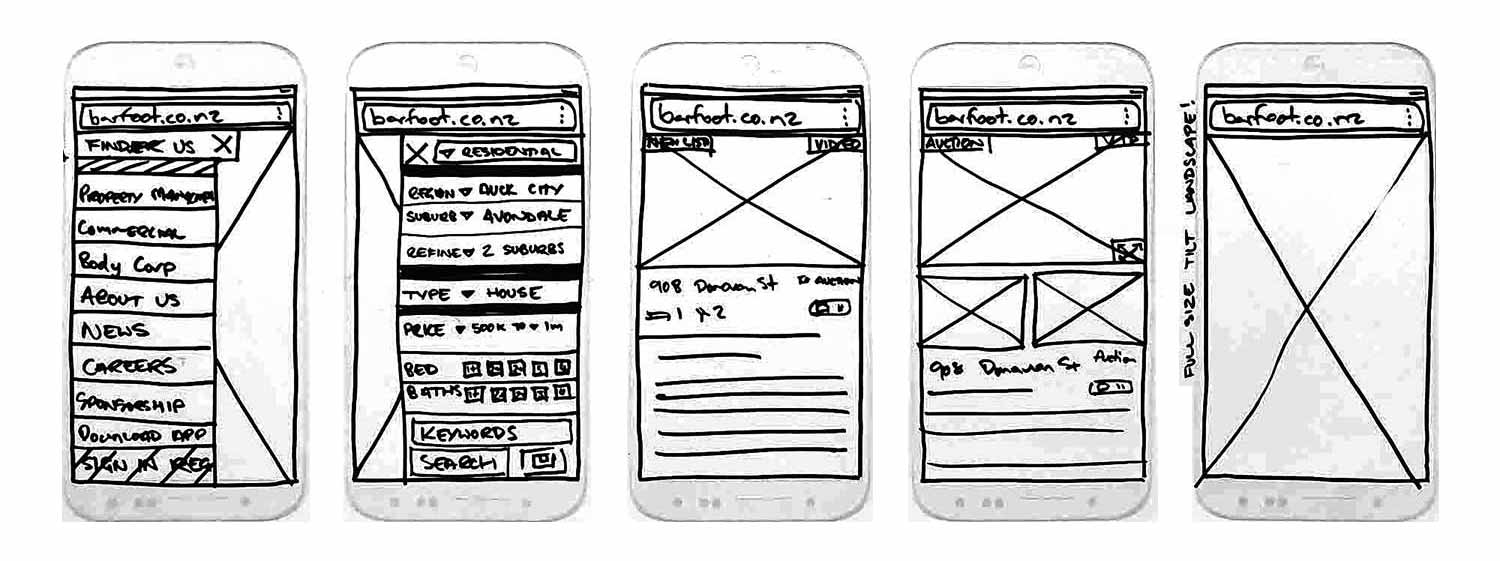
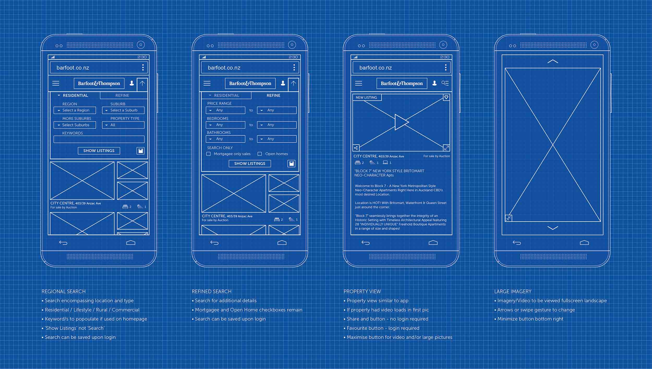
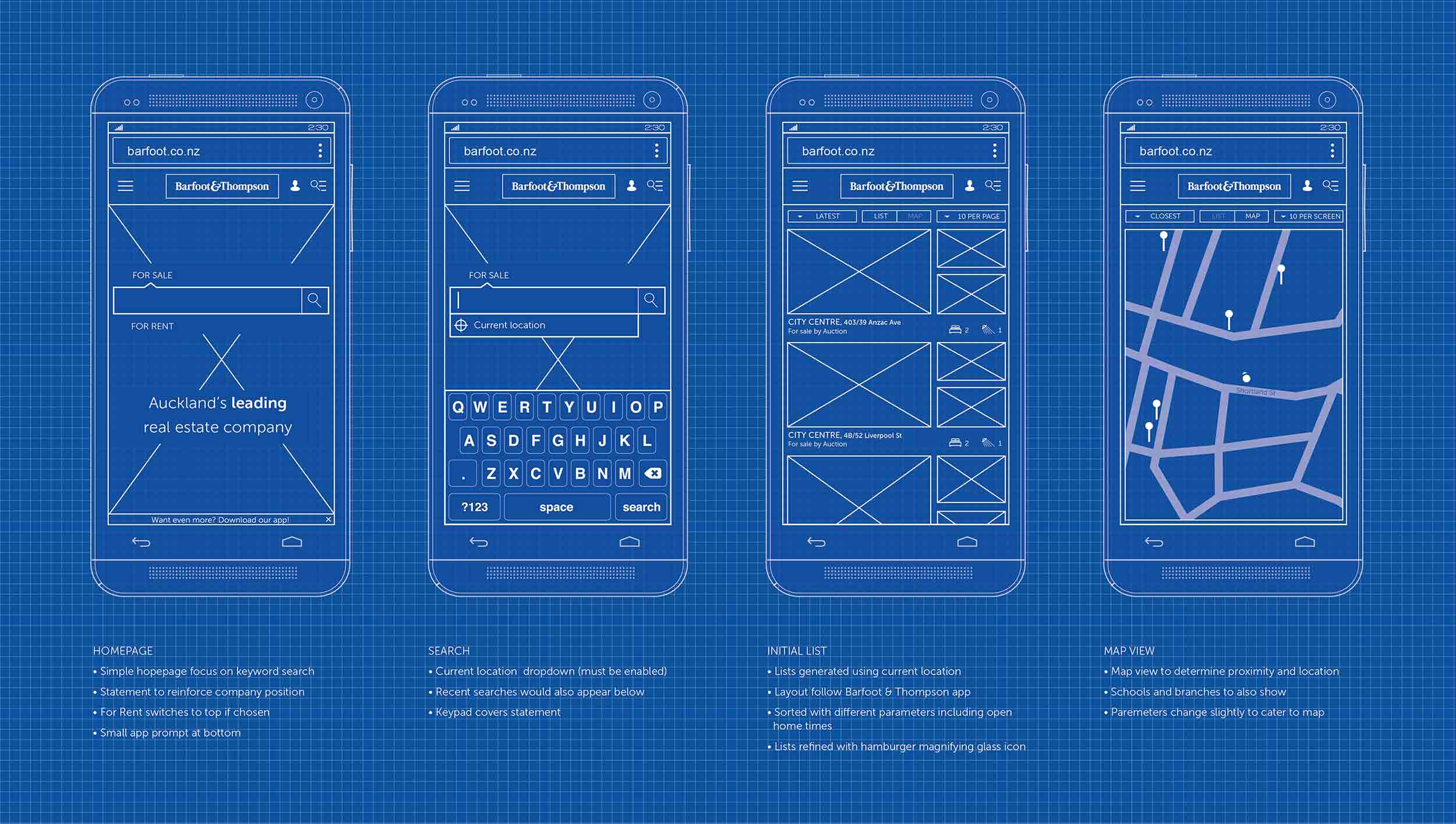
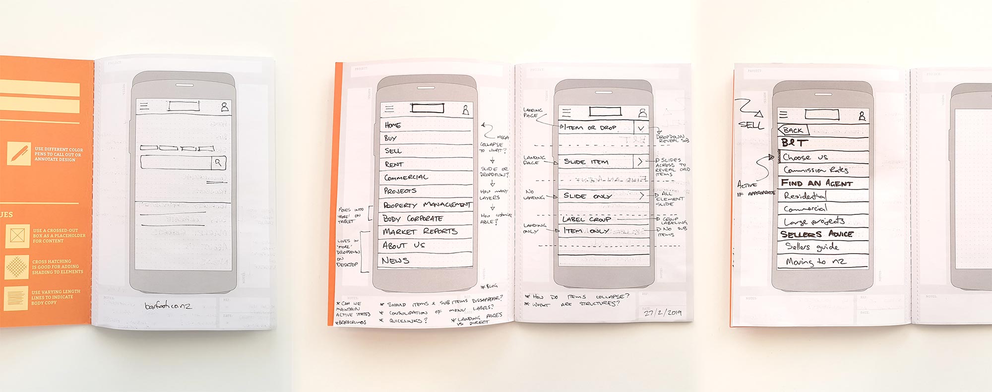
Using a variety of wireframes I evolved a concept from static images, Invision prototypes and finally a responsive prototype. These low and high fidelity prototypes were used to show users what we were intending to do and feedback was used to further refine the design. These prototypes were also helpful to share with developers to test feasibility, again their feedback was invaluable.
Once we were confident that that the idea was refined the concept was handed over to the development team to build the MVP - the homepage, property search and property page.
Keeping a watchful eye on real estate portals
Whilst a significant departure from our old property search we were confident that the new design would be a success. Our user testing had been well received and our developers were comfortable that the design was straight forward to build.
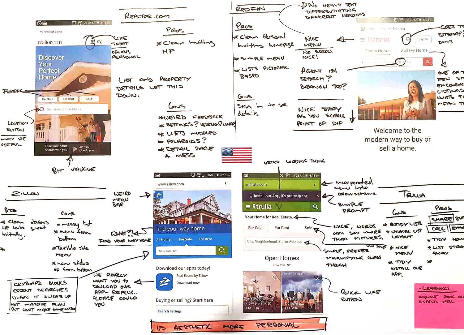
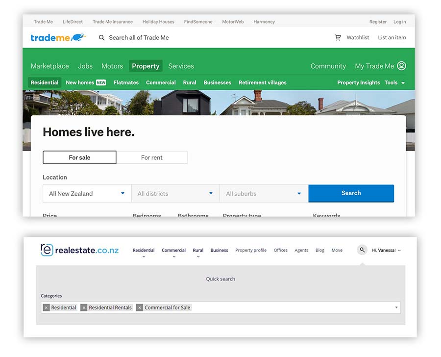
It is worth noting that over this time I had observed both Trademe and realestate.co.nz redesign property search with very mixed results. Both portals took risks by overcomplicating the search experience. Both redesigns were eventually rolled back and taken in another direction. Observing this showed that keeping the design and build simple whilst leveraging established search best practises gave us the best chance of a successful rollout.
Roles & Responsibilities
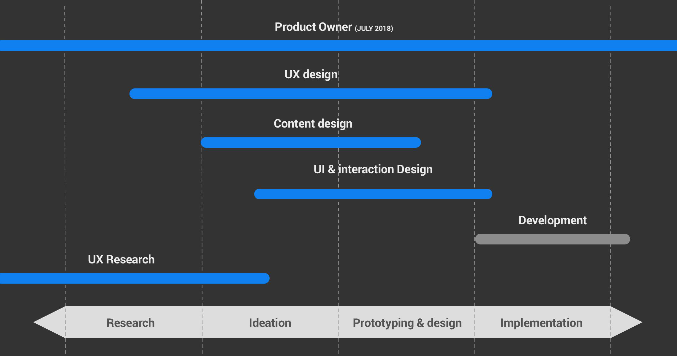
I led the project at the research phase through wireframes and ideation ultimately supplying our dev team with fully responsive prototypes for build. Excepting the build of the site I lead all work on the project.
My responsibilities included but weren't limited to:
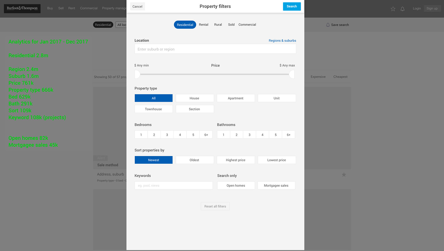
- Google analytics analysis
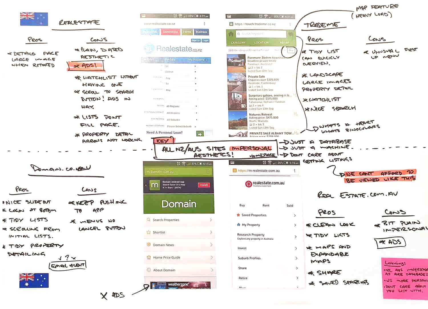
- Competitor analysis
- Conceptualising using sketches & wireframes
- Documenting user flows in Sketch and Invision
- Design and build of static and fully responsive prototypes
- Heatmap, video recording analysis
- A/B testing
The team
The in-house web app team delivered the project and were also responsible for the build and maintenance of multiple other projects. Work was allocated in 2 week sprints and planning and resource meetings occurred fortnightly with scrum meetings daily. The team consisted of:
- Tech lead
- Developers x3 (one remotely located on alternate weeks)
- Testers x2
- Digital marketing co-ordinator
- UX designer

Product owner
With the departure of our business analyst in July of 2018 I was made product owner of barfoot.co.nz. This required that I scoped and specified all work and managed development resource. This was primarily handled in Jira grooming the project backlog and running sprint planning meetings. Skills developed in this role that were outside of a normal UX role included:
- Scheduling of web deployments
- Recognising maintenance and house cleaning were necessary at the completion of large pieces of work
- Co-ordinate with outside teams (API and dev-ops) to ensure the required dependencies were available for our features to then be built and deployed
- CIO updates to relay to the board
Tools
There are a lot of brilliant tools available for a UX designer. The earliest ideas always start with pen and paper, quick sketches and note taking. More complex note taking happens in GSuite or Microsoft tools.
Below are the main digital tools I used to throughout the process from analysis to the management of the build.
Analysis
UX / UI
Handoff
Management
Scope & constraints
There were no pressing time constraints on the project. There was however, a little apprehension surrounding how an agile project may be received, especially the possibility of combining old and new pages. These concerns proved unfounded and there were no complaints upon the first deployment given how much was achieved in a comparatively short timeframe.
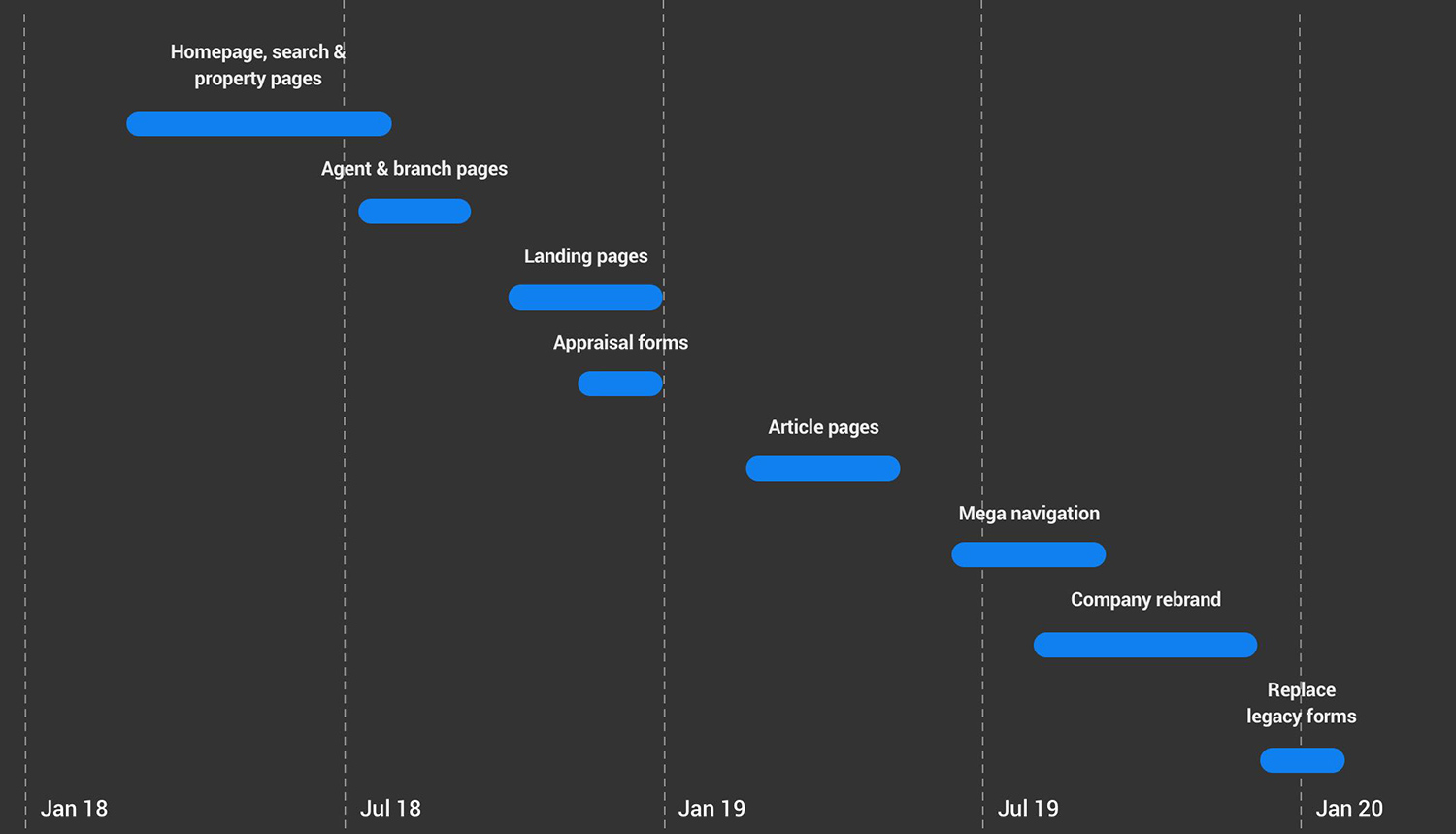
Major enhancements were delivered in the middle of 2018 and continue to this day.
Agile, mvp and the 80/20 rule
Delivering a minimal viable product and further new templates in an agile way had its downsides. Redesigning 8 key templates was enough to account for 80% of all barfoot.co.nz pageviews. We were able to make a noticeable improvement to the site quickly and efficiently.
The success early on impeded the rest of the redesign. The question became ‘Why spend comparable resource to address only 20% of the remaining traffic?’. We were all heavy users of the site and to most the redesign looked complete. New projects were always on the horizon and development resources were frequently diverted away from barfoot.co.nz. Incremental improvements still occur but the site now currently sits with large areas of articles in the old design format.
The user is not always king
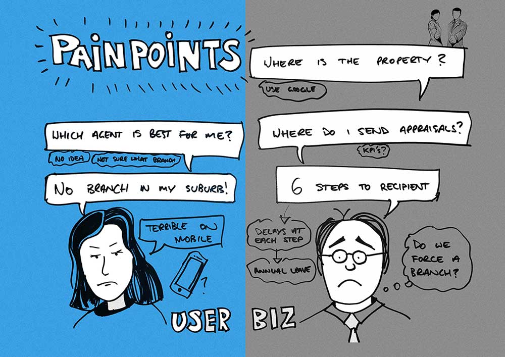
One particular feature we developed on the site enabled the user to input a suburb or collection of suburbs and they'd be returned a list of agents who had sold in the area sorted by number of sales.
When the feature was conceived it was what I felt to be an original and useful idea. Our users had expressed difficulty in being able to find competent and experienced agents and that being provided with a list of potential candidates would be helpful.
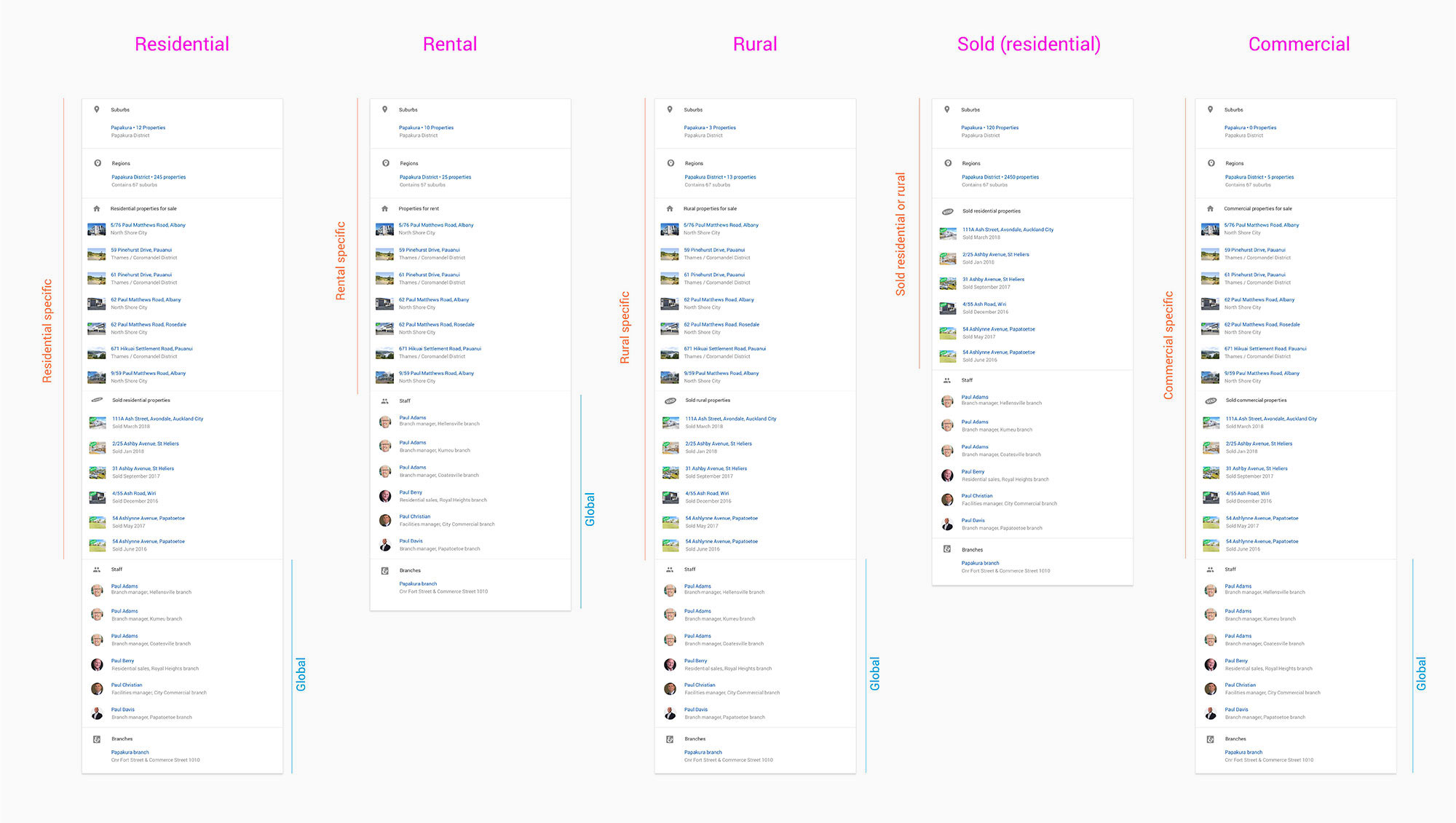
It took a few months to refine the designs and a similar timeframe for the API team to prioritise the project and deliver endpoints required to feed the front end.
Shortly before work began to add the feature, the business became uncomfortable with how it might potentially disadvantage newer agents. Public rankings had never been disclosed.
Despite the value this feature would have added for our users and with very little work left to go before it could be deployed, the feature was scrapped. From a user perspective I was disappointed that we weren't able to deliver a very helpful feature. However the potential for negative internal PR was deemed to outweigh its the benefits to the user.
Learnings & conclusion
Overall the team were proud of what we achieved. All key outcomes were met and the company saw wholesale quantitative improvements detailed below.
Key outcomes evaluation
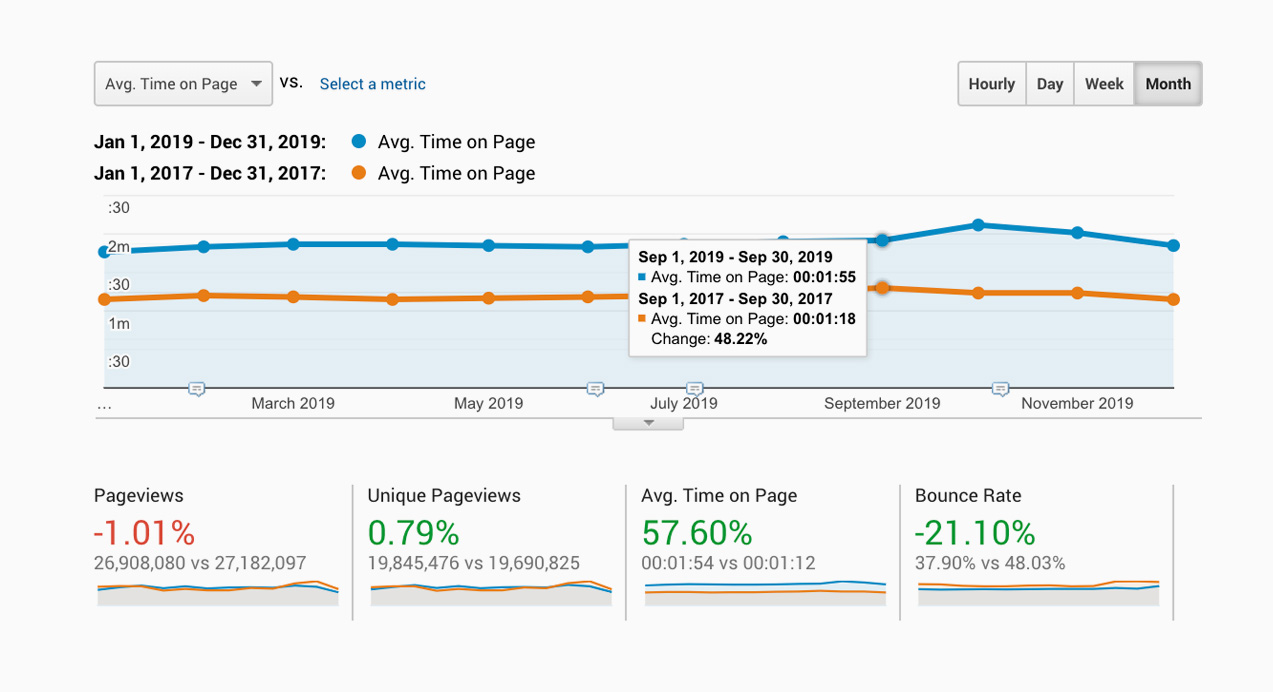
The most dramatic improvement was that time on page increased by 57%. This is particularly impressive given there were 27 million page views in 2019. On top of that the bounce rate site wide was reduced by 21%. These results signified that uses were accessing the information they wanted quickly and were more engaged once they found it. While there was a small 1% reduction in page views I was surprised it wasn't more when comparing the buoyant property market in 2017 and a lacklustre 2019.
1. Target key pages first using agile principles
Past waterfall redesigns and rebuilds had been underwhelming upon release and had dragged on over years. We were able to make considerable progress in under 6 months by targeting the pages with the most traffic. The momentum and trust we gained early from the business enabled us to continually enhance the site using agile principals.
2. Increase new business leads to our people
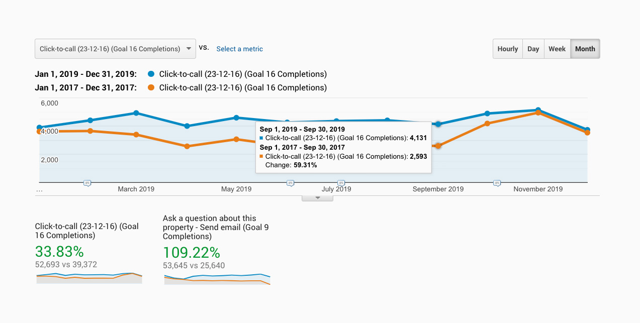
We were able to significantly increase the leads to our people by making them more visible on the property pages on desktop. On mobile a sticky footer with 'Call agent' and 'Email agent' buttons made making contact simple. This resulted in a doubling of enquiries to our salespeople via our property pages.
In 2019 mobile page views exceeded desktop page views consistently for the first time. That goes some way to explaining the 33% increase in click to call leads to our people. It will likely increase as mobile traffic grows with global trends.
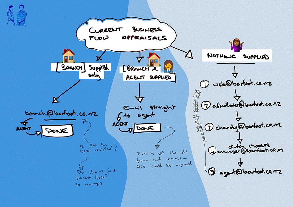
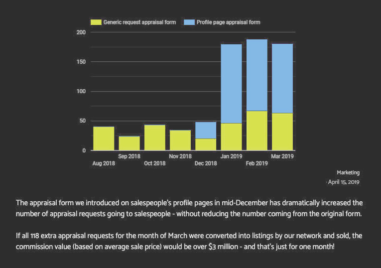
Additionally we were able to also dramatically improve the amount of request to appraise a property via agent pages on barfoot.co.nz. Previously the form was clunky and longwinded. We were able to streamline it to be far easier to use resulting in over 100 appraisal requests a month.
3. Showcase the property we market in the best possible light
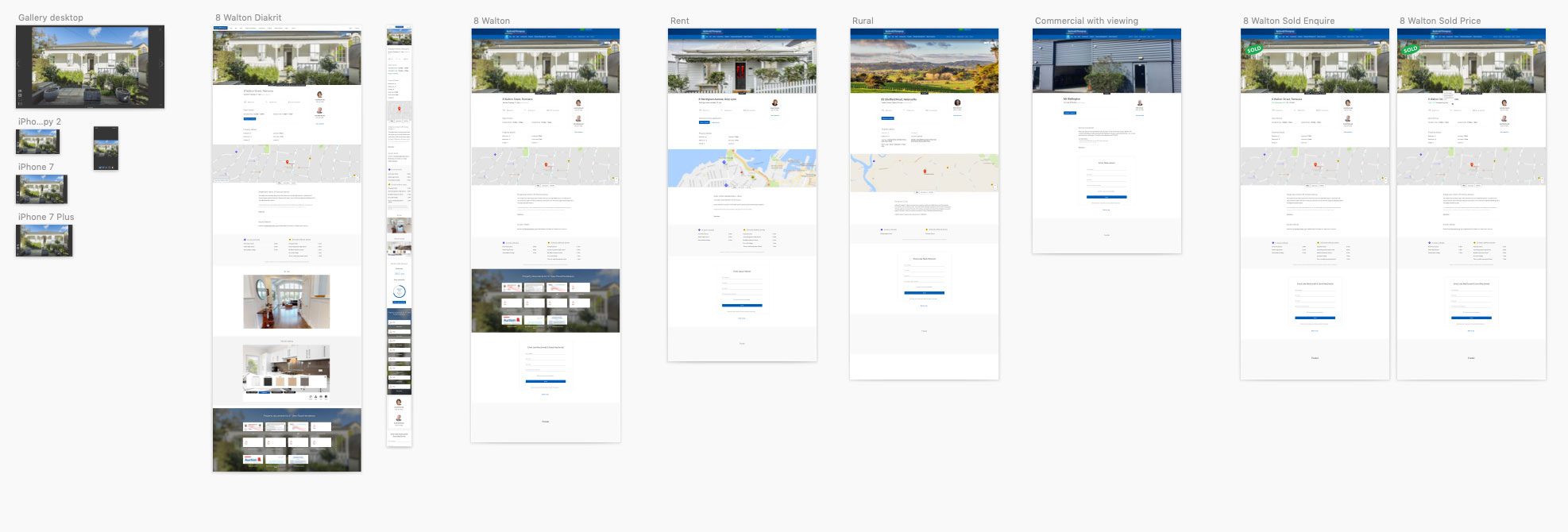
It wasn't hard to improve the way we marketed property on barfoot.co.nz. We upgraded the old carousel to a full page light-box and increased the size and quality of property imagery. This method was taken from mobile apps and we applied it to our responsive design. Property documents, google maps and school zones were added in-line onto the page adding richer, property specific information for the user. As mentioned earlier a dedicated street view button was added (RIP Pegman).
Users had told us that hero images of properties could often be deceptive. On search results pages we added a small carousel so users could quickly preview 5 images without entering the respective property page. This no doubt contributed to a reduced bounce rate from 69% to 38% specifically on property pages between 2017 and 2019 respectively.
4. Portray the company and it's people as industry leaders and experts
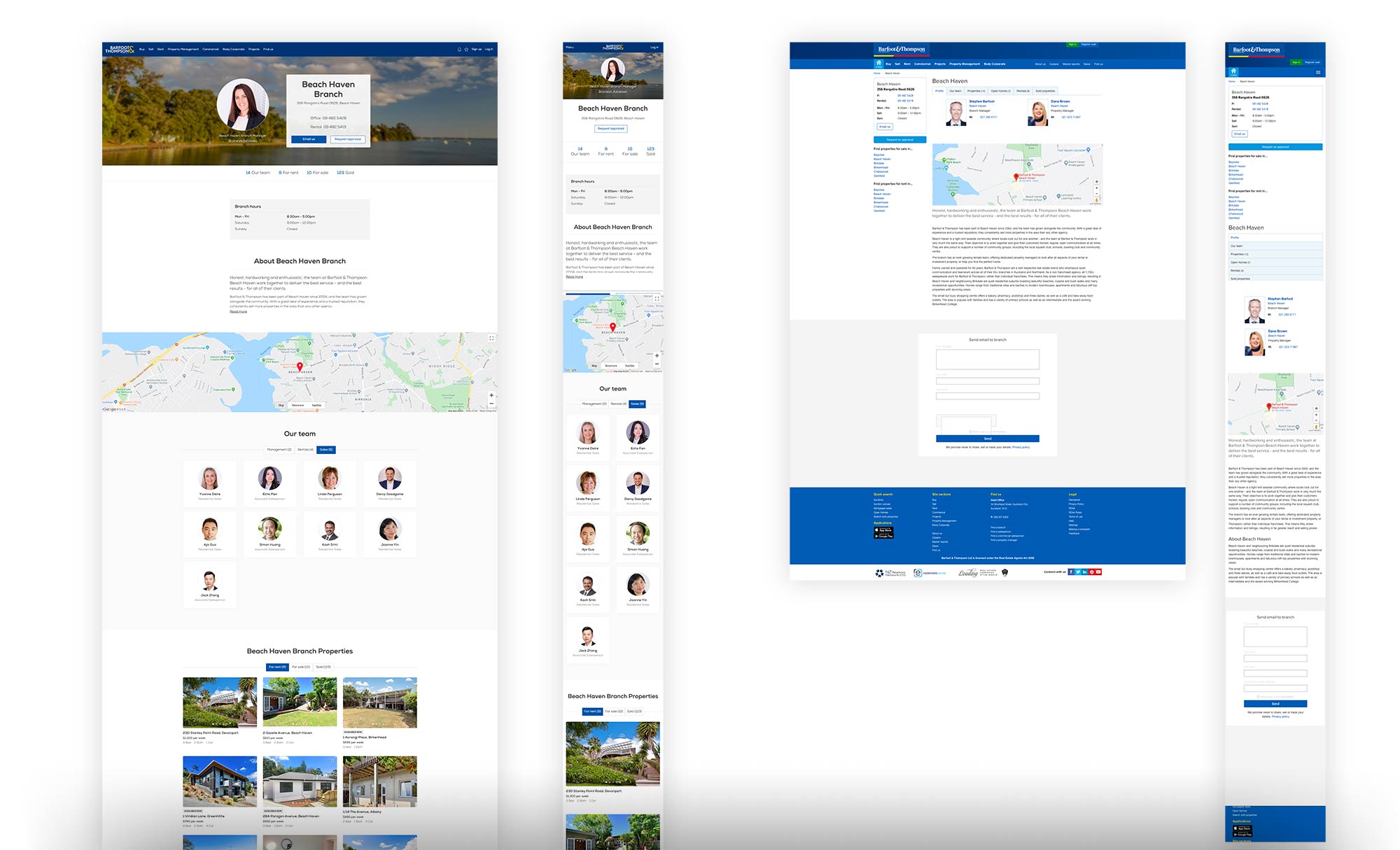
While it is difficult to quantify the improvement to the portrayal of the company and its people, the aesthetic appeal of the site was quite obviously improved and the analytical improvements suggest they were well received. We improved our branch pages as shown below, by personalising the background imagery to give the branches and agents a strong connection to their local areas.
The overall improvement in the sites aesthetic and the reduction of clutter likely improved the perception of the company. The fully-responsive design removed quirks and inconsistencies for users and the reduction in bounce-rate suggested users were getting to where they needed to go more efficiently than before.
On the whole, the pages were well received by the company.
5. Provide a great experience on any device
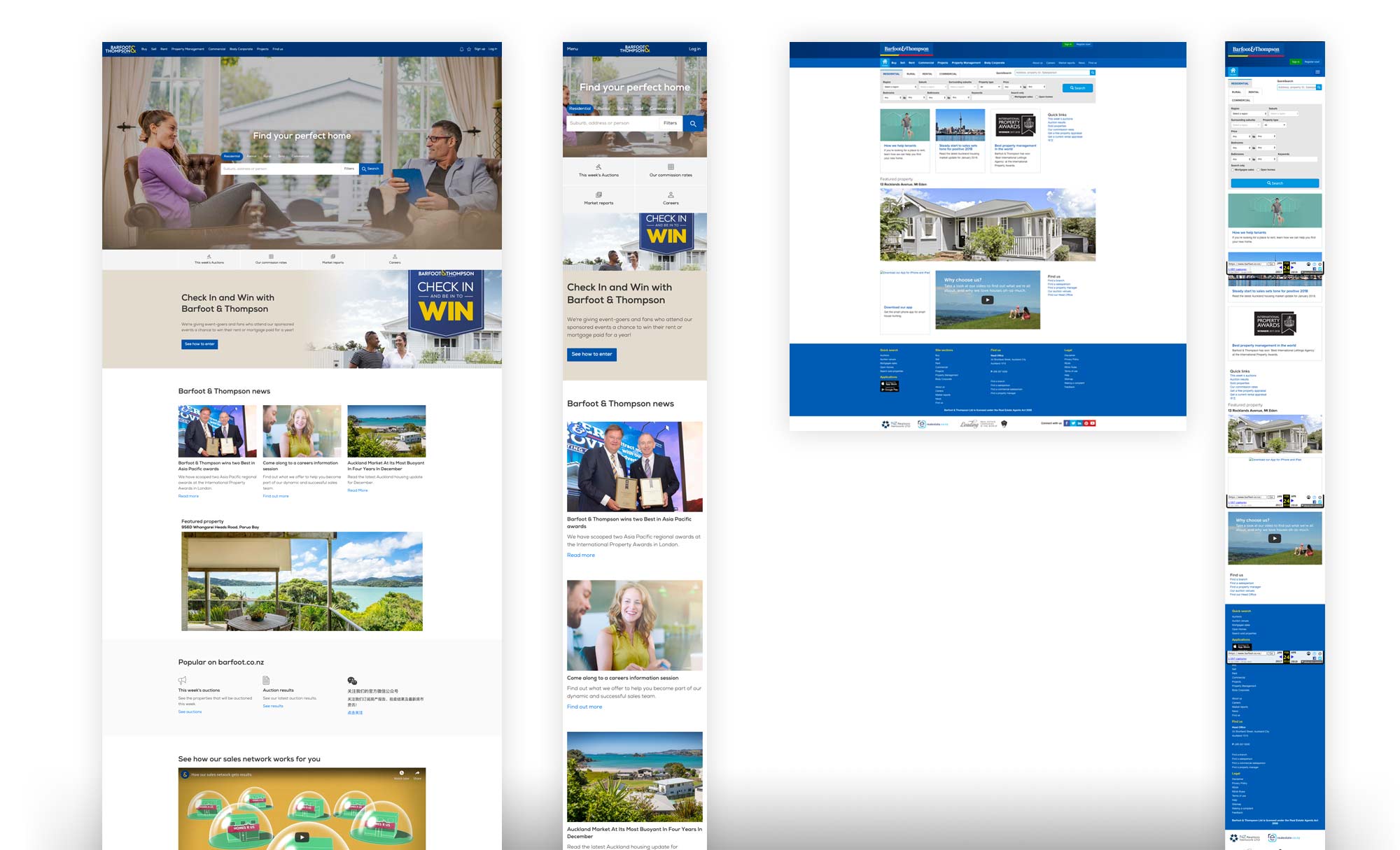
By moving to a fully responsive site it was reasonably easy to deliver on this key requirement. As discussed above using features like sticky menus and collapsable mega-menu navigation we were able to vastly improve the user experience across devices. In 2019 mobile traffic grew to overtake desktop and the responsive design has assisted this growth as well the global trend toward devices.
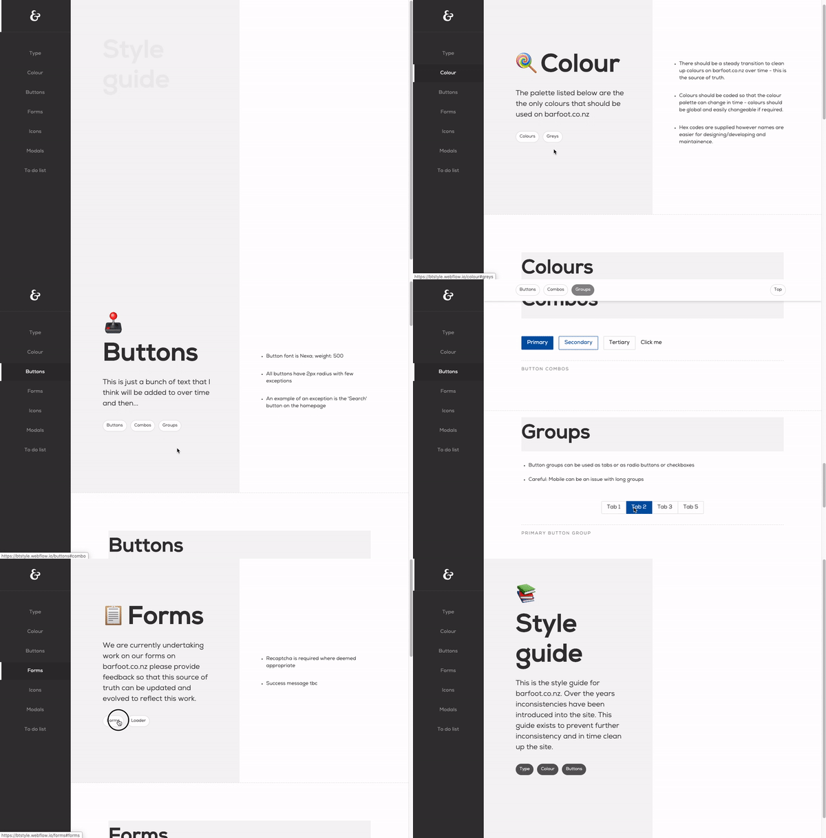
I created a small style guide that proved very helpful in maintaining consistency when handing over designs to our various developers. This created a disciplined specification for both.
Note: High fidelity handovers work best
There were many tools used for design and for handing over specifications to developers. Invision wireframes were effective for flows but were not a responsive solution. Zeplin.io screens were good for aesthetics with precise measurements (pixel based), yet were also not responsive.
Outputting different designs for different media queries was tedious and difficult due to ensuring consistency styles - this is something that is more straightforward in code.
Producing actual responsive prototypes became the preferred way to design and to handover. As my Webflow skills developed I was able to deliver responsive prototypes at the same velocity as previous static designs.
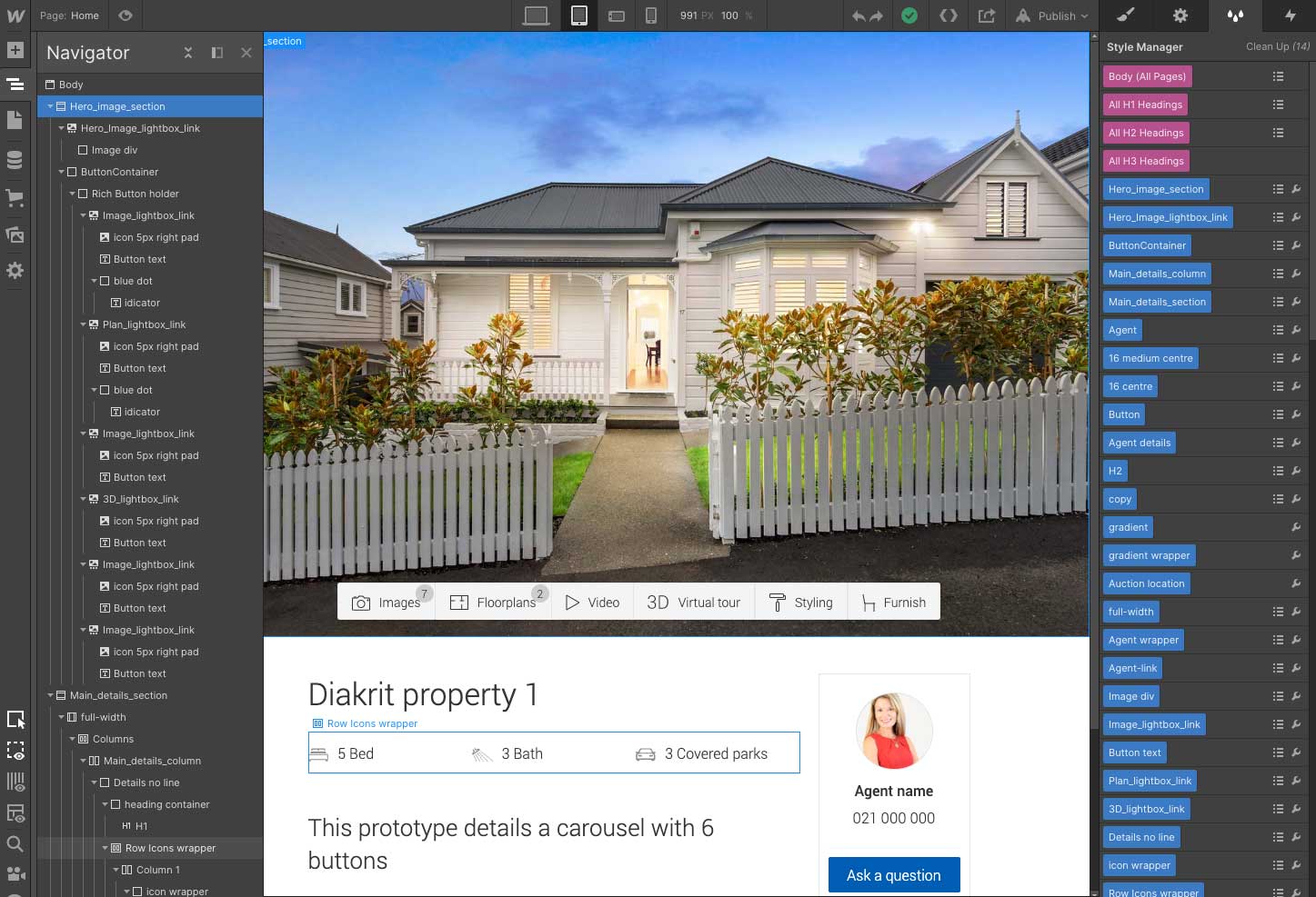
Responsive prototypes became the only way to handover. The benefits were many and included:
- Static designs don’t consider the code, responsive prototypes have to - they are built in code
- Developers have the backend, the CMS, API endpoints and all edge cases to contend with - a high fidelity responsive prototype means the front end is largely complete
- All assets, specs, rules for margin/padding etc can be pulled straight out of the browser inspector
- Browser support was considered and resolved in the design phase
- With a working demo available Jira/trello cards become far more succinct and easy to follow for devs and testers - they were also easier to write for BA’s/product owners
- It is far easier to gather user feedback from a partially functioning prototype as there is less left to a users imagination
- A working prototype... works; so it’s easier to feasibility test with developers
