Auctions Management redesign
Problem statement
In late 2018 Barfoot & Thompson were considering replacing the suite of products that controlled all auctions held by the company. All the apps were considered legacy, posed security risks and had poor UI/UX.
The apps
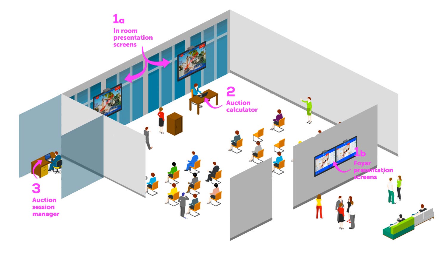
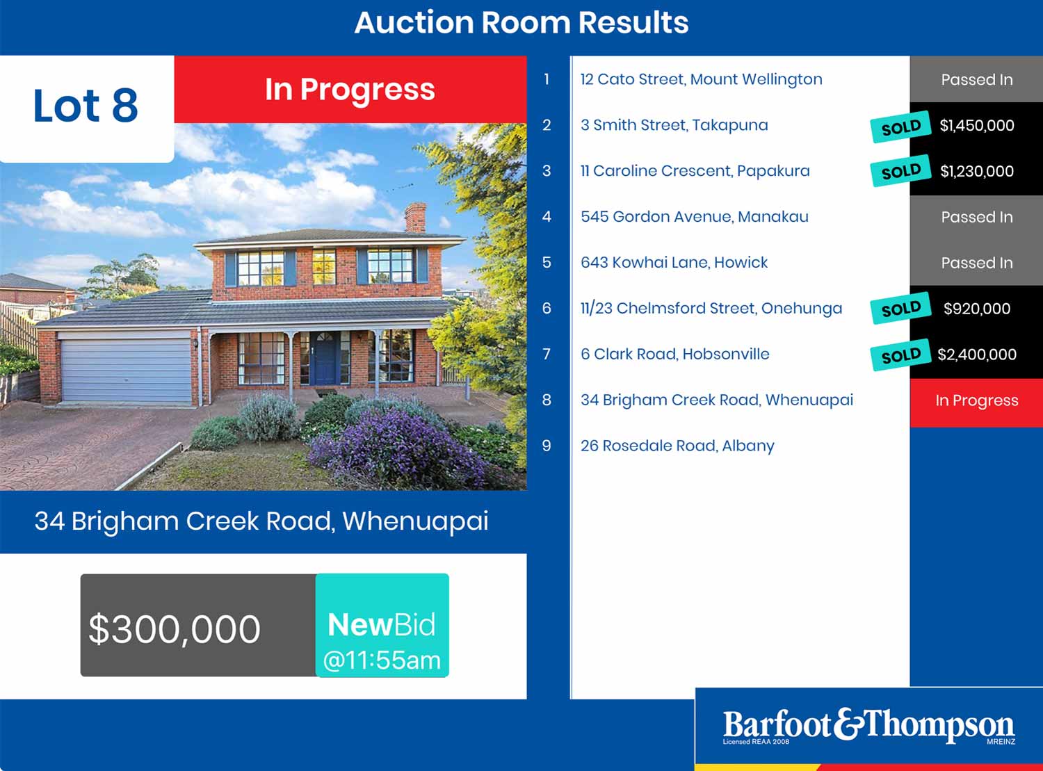
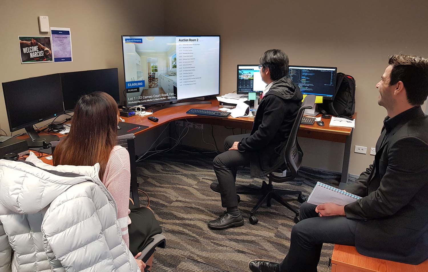
- Auction Presentation The public presentation showing viewers the current status of a property in-room or all lots in a session in a foyer.
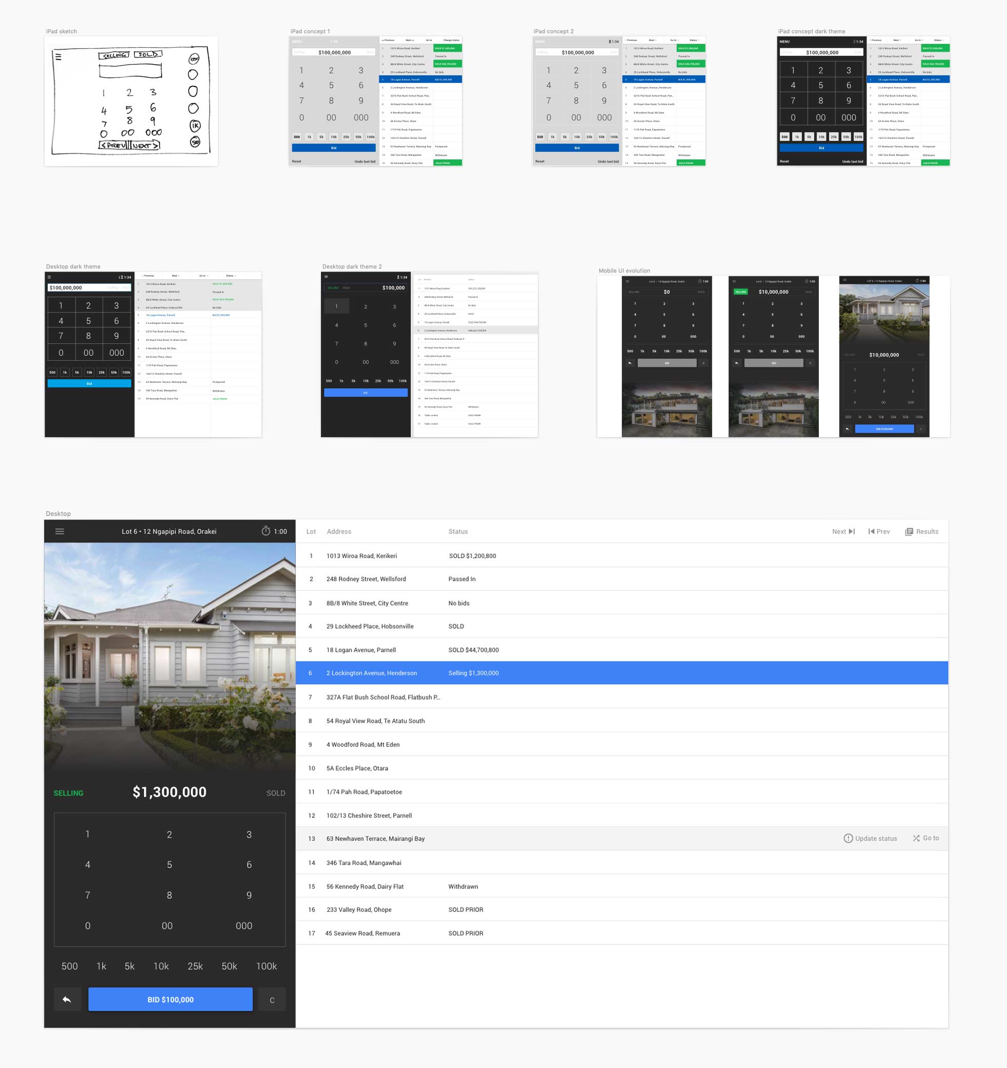
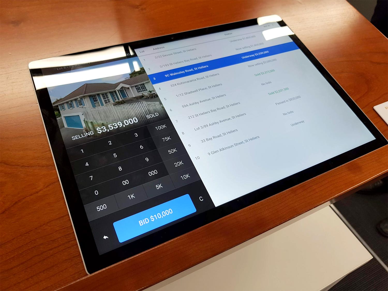
- Auction Calculator During a live session an administrator would enter bids via the auction calculator that would display on the presentation screens.
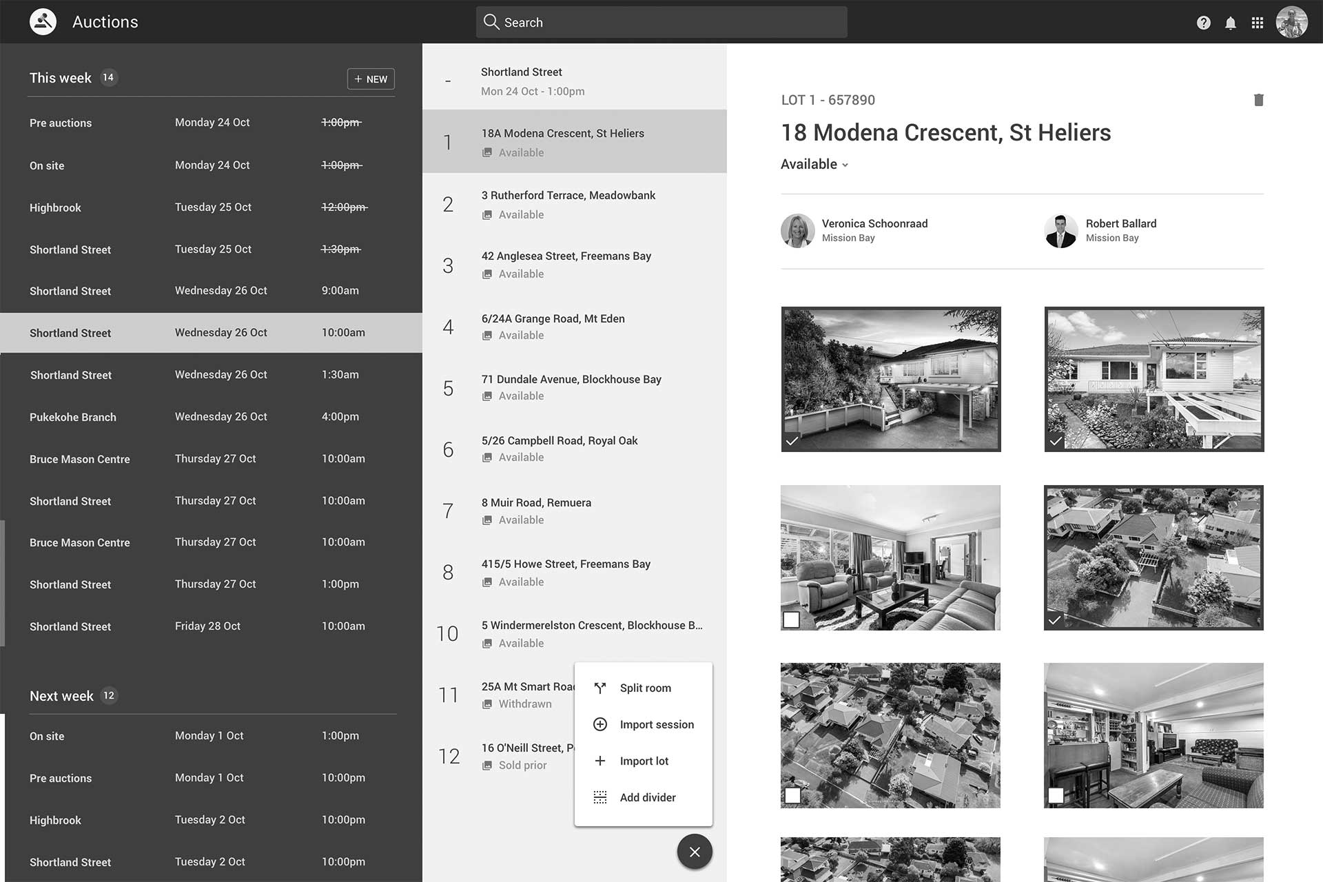
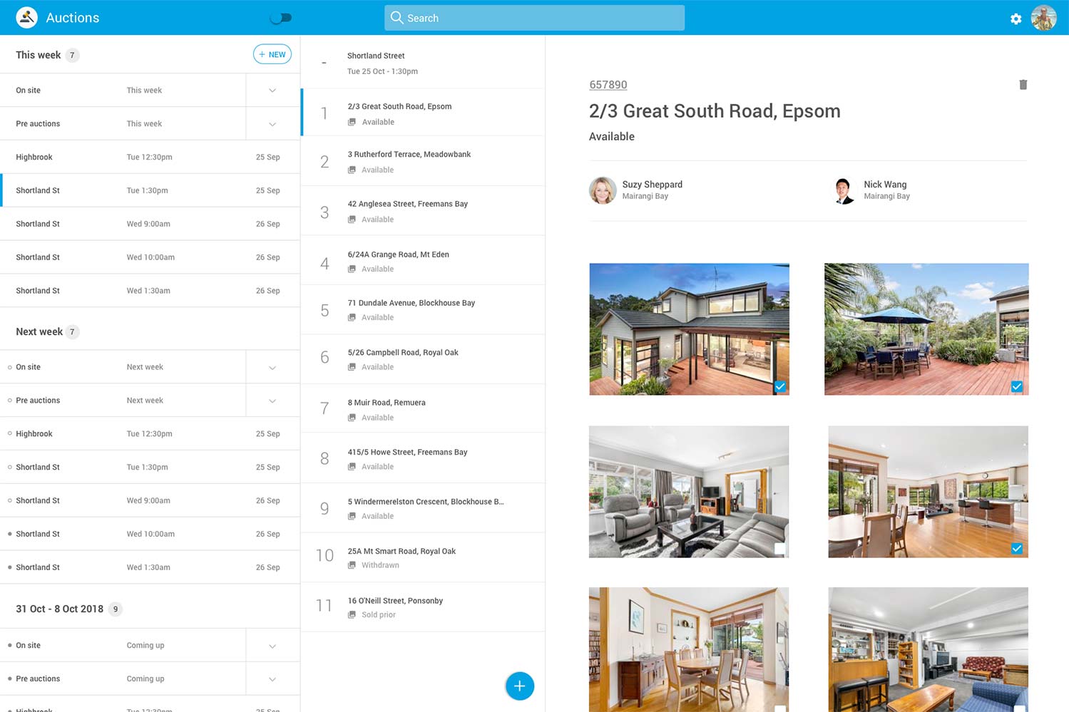
- Auction Manager Prior to the session an administrator collates and organises properties into venues, sessions and lots using Auction Manager.
Desired key outcomes
The high level outcomes the company outlined were:
- Target key apps first using MVP and agile principles.
- Significantly improve the way the company showcased properties during auction sessions.
- Reduce auction administrator effort by automating processes where possible.
- Explore opportunities to innovate on new technology.
The idea of streaming auction video and allowing online bidding was discussed at length between company stakeholders. It was decided that incorporating this type of functionality would increase the scope of the project too far. Another concern included making auction bids and sold price public - information that could alienate vendors.
The initial state
While the apps were functional they had many issues. Issues common with legacy apps were frequent and included:
- The Auction Manager was not responsive and only worked on Microsoft Internet Explorer browsers.
- The Auction Calculator was built in Actionscript 3/Flash and only available on in-room devices.
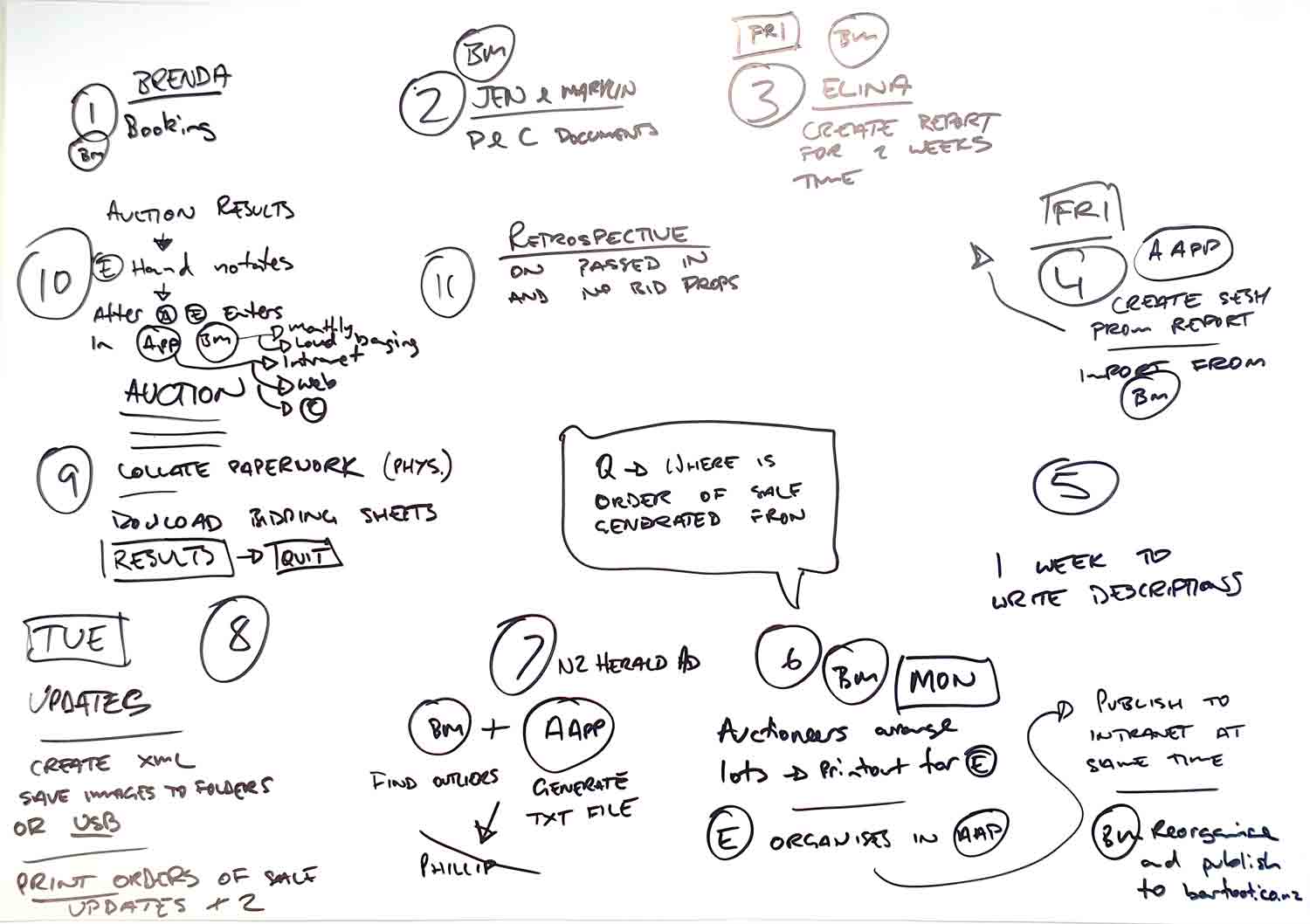
- Onsite Auctions were conducted outside of the system using pen and paper and entered into the system post auction.
- Redundant functionality had not been removed over the years which made for a confusing user experience.
- User interfaces were clunky, ill considered and old fashioned.
- Excessive property information was displayed to the public which took several hours to curate each week.
- Historic bidding records required for legal matters were only accessible to technically minded users by querying a database.
- Siloed information - session data had to be transported between devices using an SD card.

Investigating an out of the box solution
During the beginning of the project Barfoot & Thompson were contacted by GAVL offering an auction solution.
The GAVL auction calculator was demonstrated to Barfoot & Thompson and some initial screens were mocked up and presented for the Auction Presentation screens. It was interesting to see several innovations from a company focused purely on auction software. The Auction calculator in particular was simple and intuitive and GAVL had interesting ideas about opening it up to bidders who were not physically on-site at an auction.
Ultimately the cost to license the software proved prohibitive and it was decided that Barfoot & Thompson would build the software in-house.

Users & audience
The Auction Presentation app was viewed by the public and auctioneers. The work was largely cosmetic and it was clear that additional information and functionality was not required. The Auction Presentation software was a user interface exercise.
The Auction Calculator and Auction Manager apps were more complex. Fortunately there were a small group of internal users for this software and they were located in a building nearby.
Getting to know the audience
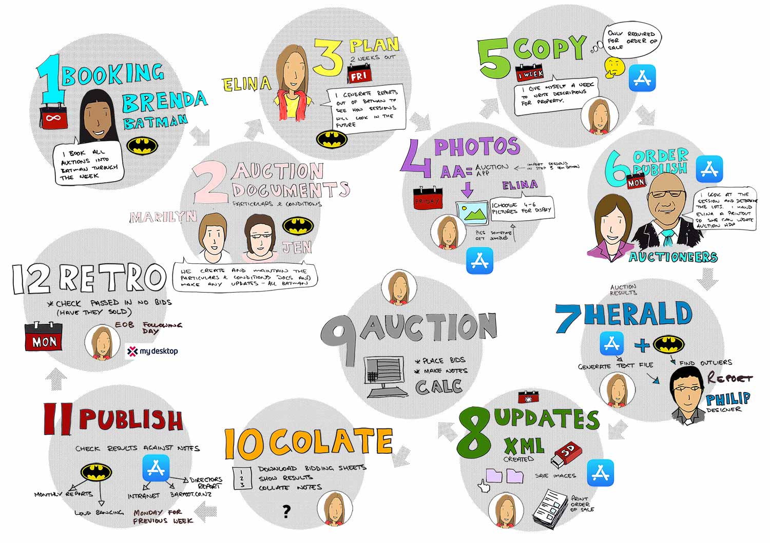
I conducted one on one interviews with auction administrators to understand using the Auction Manager and Auction Calculator apps. At the same time a business analyst documented the processes and business requirements for the software.
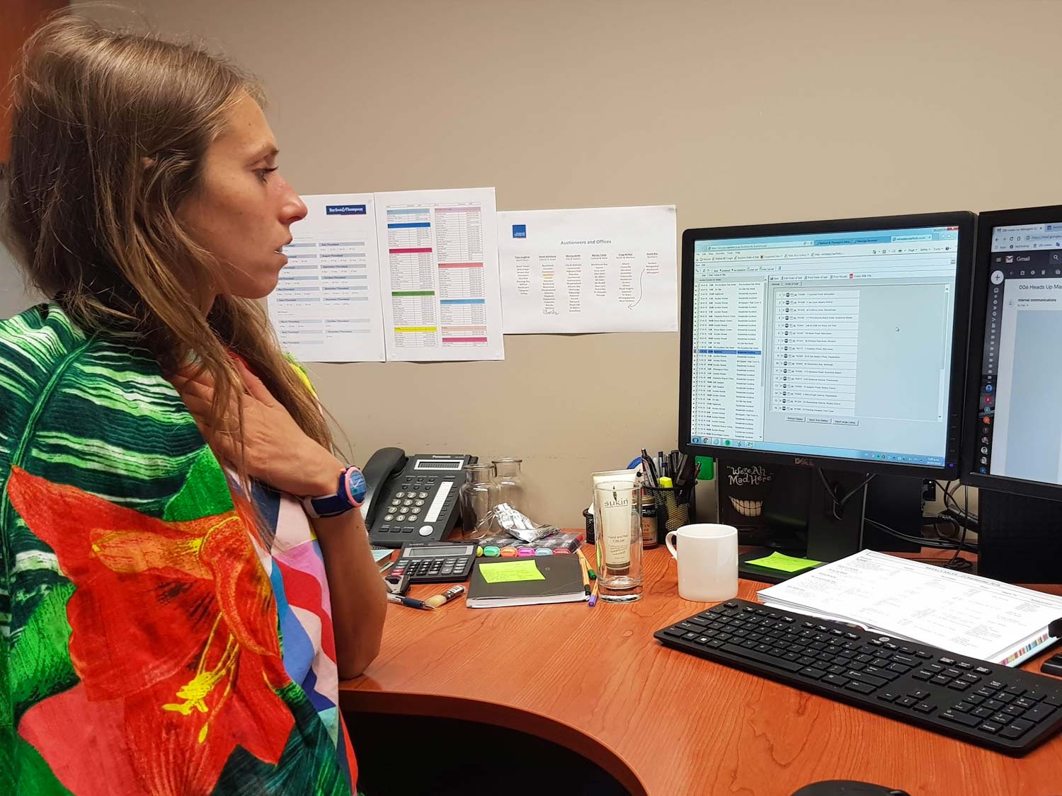
Working with the only 2 users who regularly used the software had its challenges. Over a period of years they had become accustomed to using these clunky tools. I had to work harder than usual to draw attention to quirky aspects of the software. Over time we were able to point out how unusual some of the functionality was. Invision prototypes were very helpful to communicate ideas that would dramatically improve usability.

Roles & Responsibilities
I was responsible for all UI/UX across the suite of 3 apps. My core responsibilities included but weren't limited to:
- User interviews
- Competitor analysis
- Conceptualising using sketches & wireframes
- Documenting user flows in Sketch and Invision
- Design and build of static and fully responsive prototypes
- User testing
The team
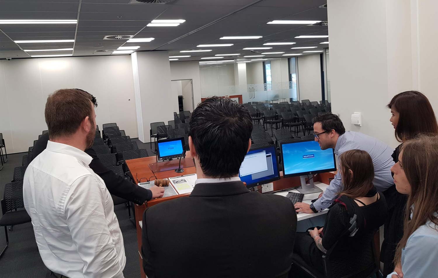
The team changed over the course of the project with people moving on at different times. The role of Business Analyst was performed by 3 different people over a 12 month period. The rate of change meant that myself and the Tech lead had to take on more project management responsibility than usual to maintain continuity and momentum of the project.
- Tech Lead
- UX Designer
- 2 x Developers
- Tester
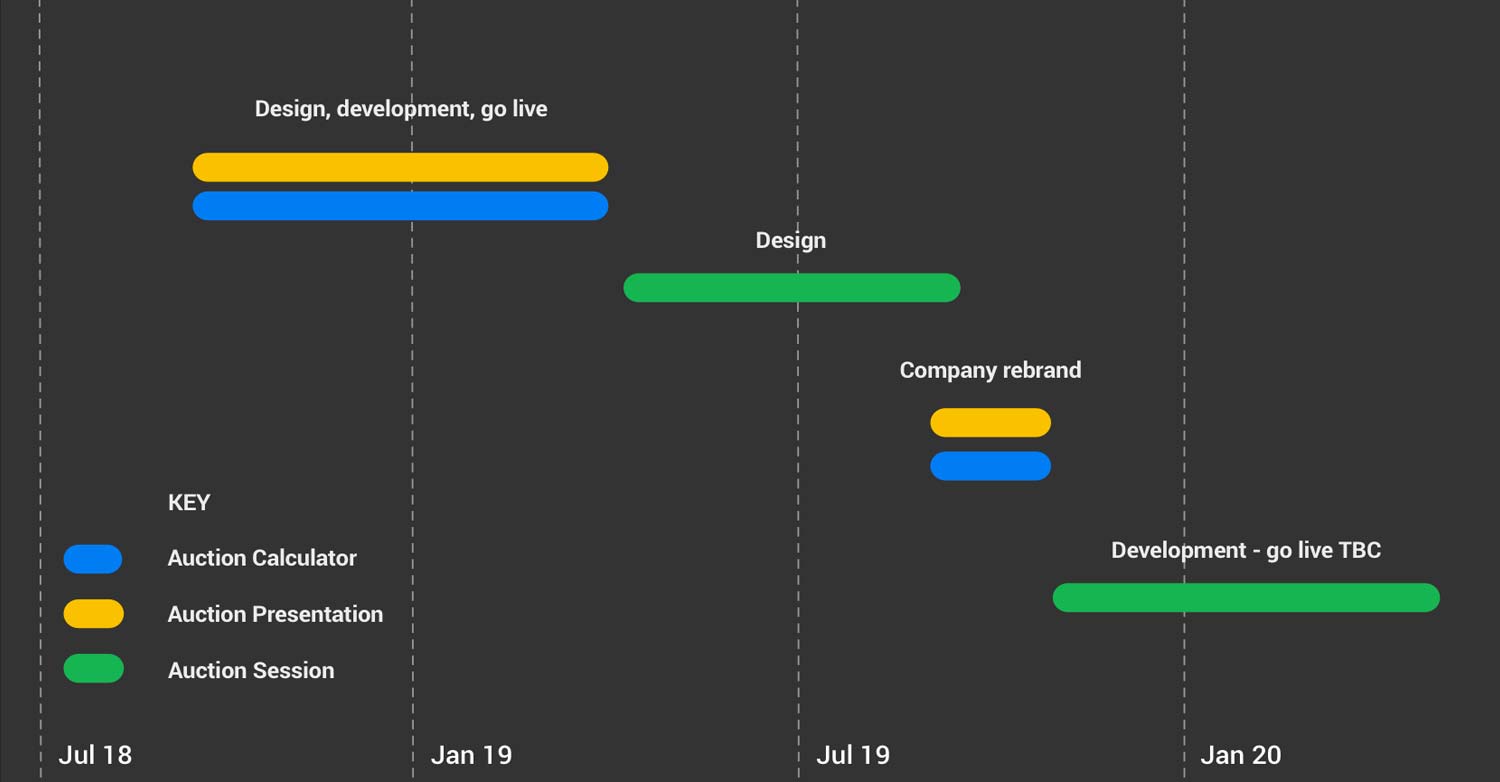
Originally a dedicated contract team of 2 developers and a tester built the Auction Calculator and Auction Session Manager. Approximately two thirds of the way through the project this was handed over to the internal Web Apps team to complete.
Tools
Below are the main digital tools I used to throughout the process from design to handoff.
UX / UI
Handoff
Scope & constraints
Redesigning a suite of products was a new challenge. It was decided early that there were dependencies shared by the Auction Calculator and Auction Presentation so these were designed and developed in parallel. The Auction Manager was left until last for a variety of reasons:
- It was not public facing and would slow delivery of the public facing apps.
- It was complex and had all the quirks associated with a legacy app ie. very limited documentation.
- An attempt to improve the Auction Manager was undertaken in 2017. It ultimately failed and created pressure that this redesign and rebuild was successful.
4k & HDTV
At the time of the redesign Barfoot & Thompson were also upgrading its TV screens. Some TVs were standard HD screens while the newer models were 4k resolution screens. From a design standpoint this had little bearing however it presented some development challenges. Standard increments such as pixels or EM’s would produce unusual results depending on screen resolution. Alternatively VH and VW were required to provide a uniform user interface regardless of the type of hardware it was displayed on. This meant more design and development meetings were required to ensure the designs looked good across all resolutions.
Learnings & conclusion
Overall the team were proud of what we achieved. All key outcomes were met and the company saw the improvements below.
Key outcomes evaluation
1. Target key apps first using agile principles
We designed, built and delivered the Auction Calculator and Auction Presentation software first. We were able to quickly replace the existing public facing apps. There was less pressure to quickly deliver the Auction Manager as it was not public facing. It was built and successfully tested with auction administrators. Unfortunately it was never deployed for reasons detailed below.
2. Dramatically Improve the way the company showcased itself and auction properties
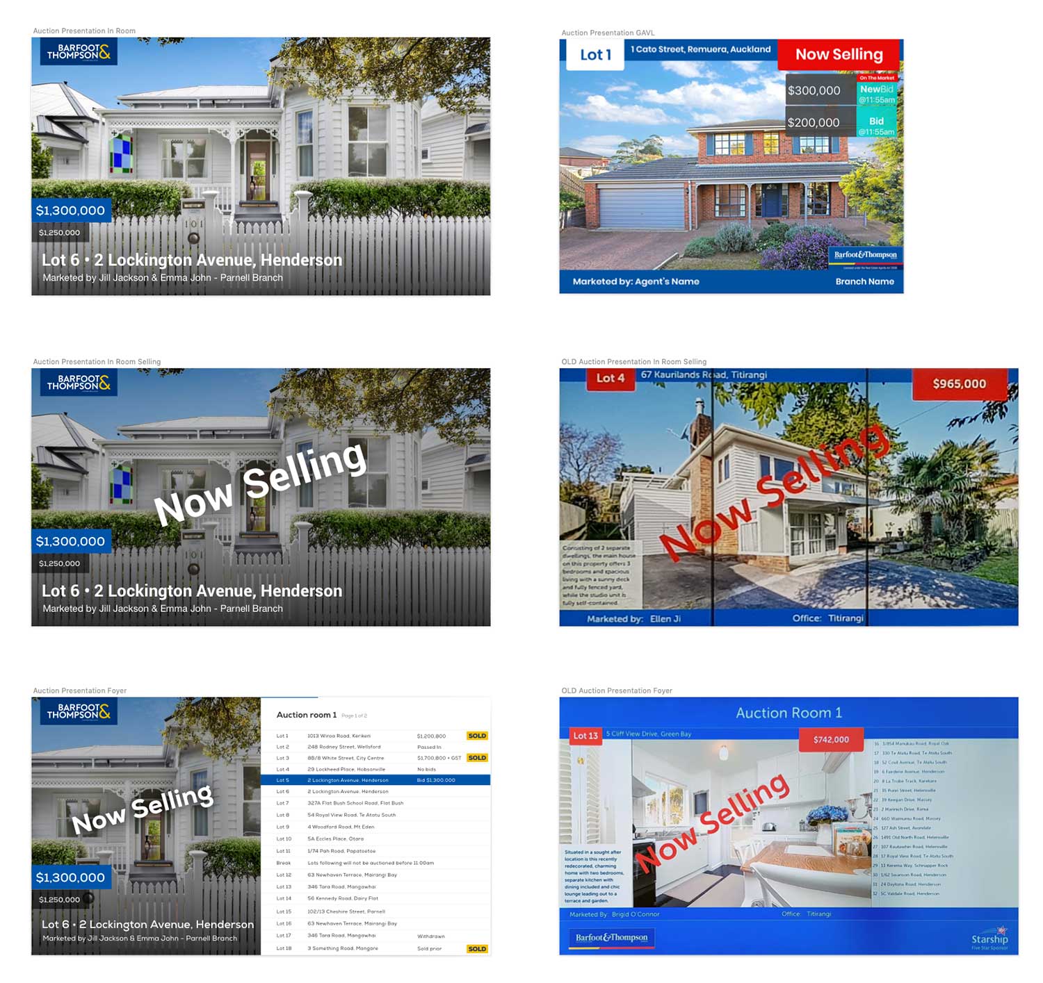
Overall the redesign created a significant improvement to the way in which auction property and Barfoot & Thompson was presented - this was critical at the point of sale. In follow up discussions with the auction team there was minimal feedback about improving the user interface. Upon viewing the new concepts against the old screens they were thrilled with the enhanced aesthetic and legibility of the Auction Presentation screens.
3. Reduce auction administrator effort by automating processes where possible.
The old presentation screens displayed excessive information that users did not value like the short text property displayed on the presentation screens. This information took several hours to curate each week. As a result, this information was removed, reducing visual clutter and administration work.
Other notable enhancements included the automation of auction results to different platforms as well as easy access to bidding sheets for retrospective queries surrounding an auction. These changes, some large and some small all added up to saving the auction administrators valuable time that could now be spent on other tasks.
4. Explore opportunities to innovate via the new apps.
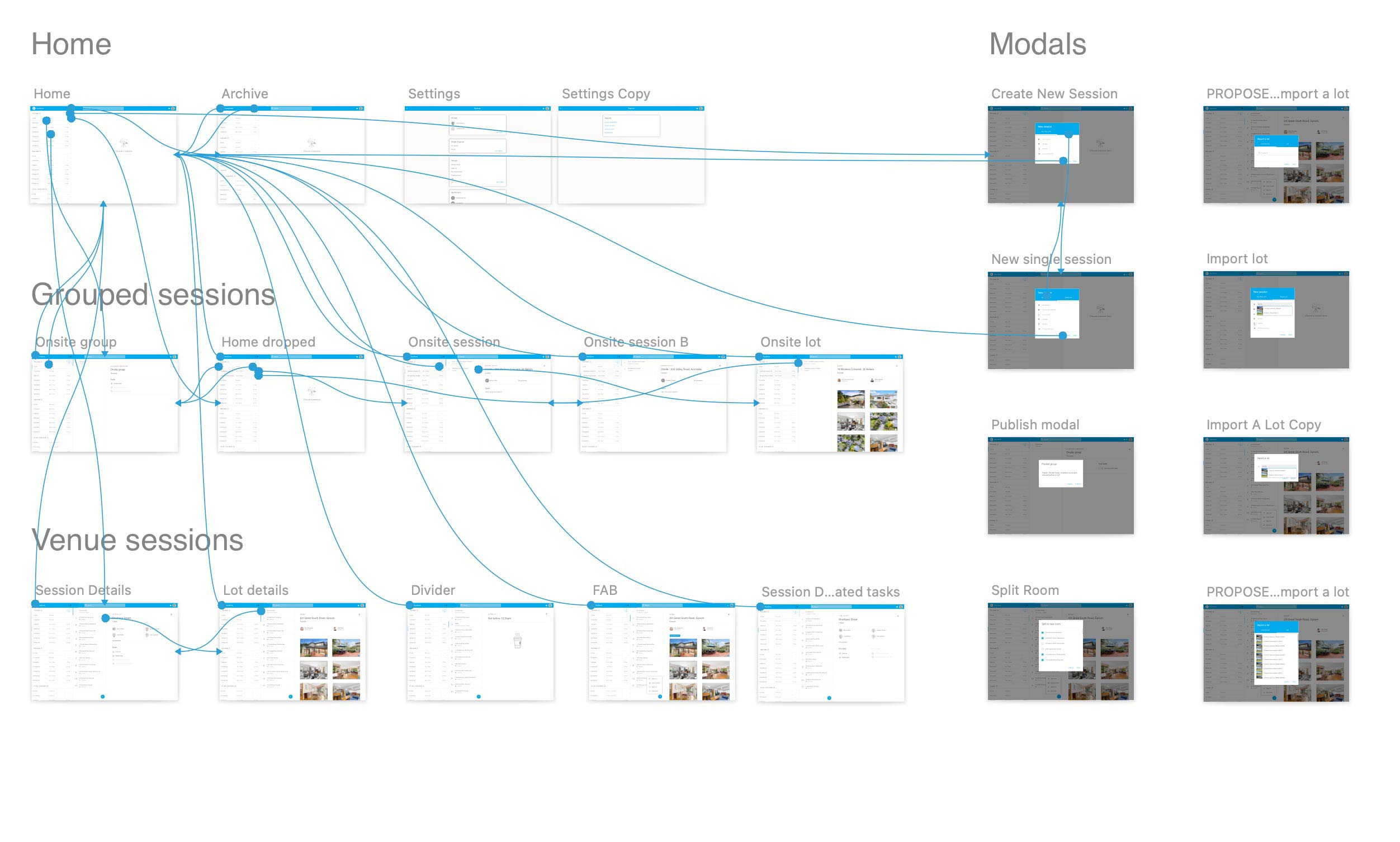
Previously, onsite auction staff had to used pen and paper to take a tally of all bids - upon returning to the office that information was entered into the system. By simply making the apps accessible across all devices auction administrators could run auctions digitally on site reducing administration effort.
Running the apps in a browser window the presentations can be displayed anywhere the company saw fit. They can now be displayed live in the Managing directors office for example.
At a later date the Auction Calculator software could also be made accessible to members not physically at an auction. This would work in a similar way to phone bidding but the user would have contextual information and would not have to rely on an intermediary to bid on their behalf.
Auction management in Auckland amid a global pandemic
The Covid-19 lockdown beginning in March of 2020 had a dramatic affect on the real estate industry. There was massive disruption across the industry and within weeks the company decided streaming auctions online was going to be critical. During level 3 and 4 lockdowns no gathering of more than 10 people could take place. Even in lower alert levels there was reluctance from the general public about gathering in communal areas like auction rooms.
The Auction Management app was never deployed, instead the entire suite of products was replaced by one called Auctions Live. This transition took place in a matter of weeks. Auctions Live enabled live streaming of auctions and online bidding by verified buyers.
It was disappointing to see the Auction Management work become irrelevant almost overnight. The apps were replaced with products that had less emphasis on UI/UX but critically allowed business to continue in trying times with superior functionality.
As disappointing as it was, it was also impressive to see such a pivot. The worries about sensitive data being broadcast across the internet quickly disappeared as live-streaming became the new normal. This feature has been an impressive marketing tool creating massive user engagement and often generating in excess of 100k page views a week at barfoot.co.nz/auctions-live.
Initially seen as a short term solution the technology was again relied on heavily during the second Auckland lockdown of August 2020. Again in the Auckland lockdowns in February 2021... and the nationwide lockdown we are currently experiencing.
Auction conducted from the home of the auctioneer in the first day of Level 4 lockdown Wednesday 18 August, 2021.
New Zealand record for purchase price at auction, $9.9m on the 26 March, 2021.
